← All workCase 08 / 10
No Cap
A chocolate bar that says it straight.
- Client
- No Cap
- Sector
- FMCG
- Year
- 2025
- Services
- Brand identityPackagingAdvertising
[ MAD® — OVERVIEW / आढावा ]
The challenge
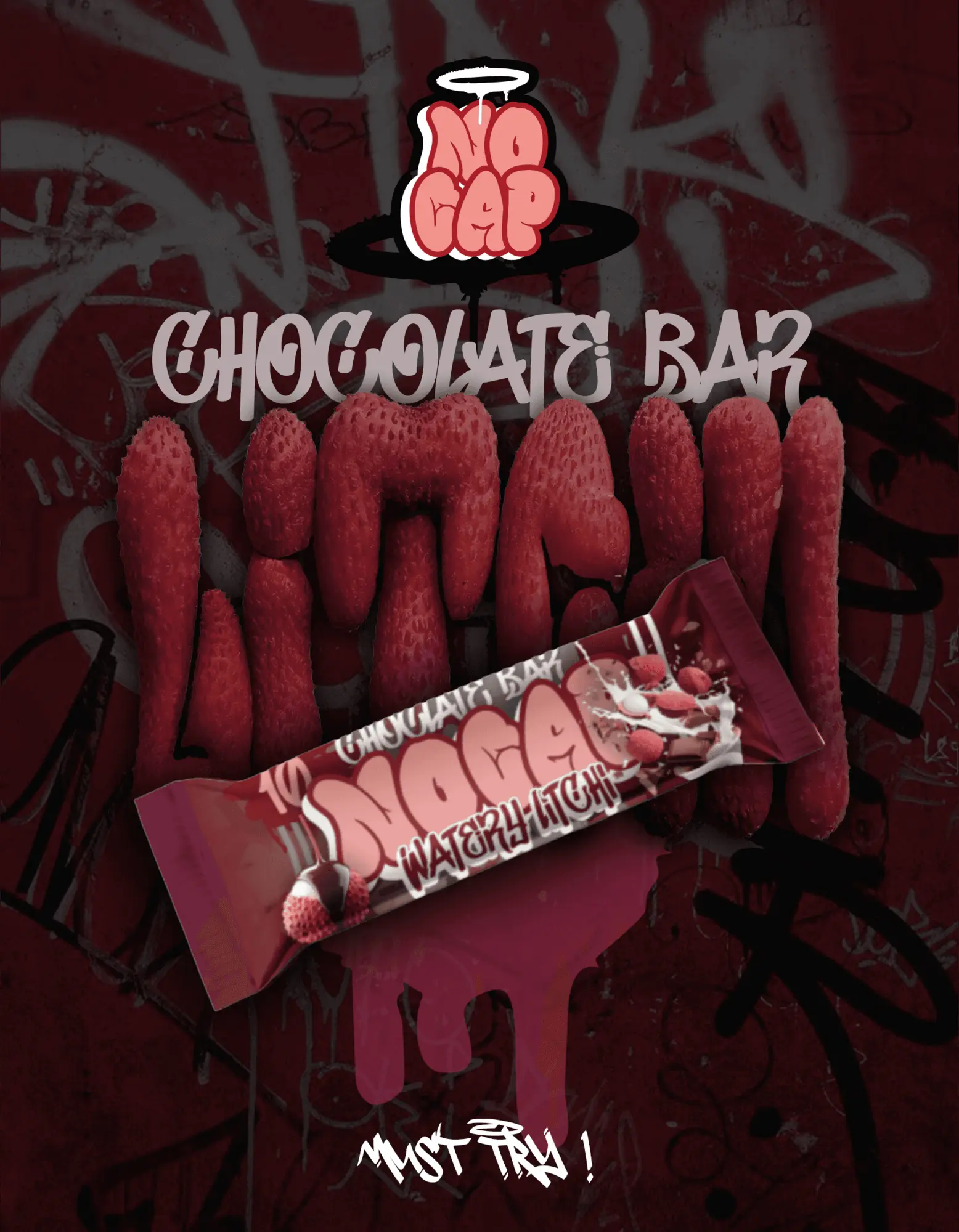
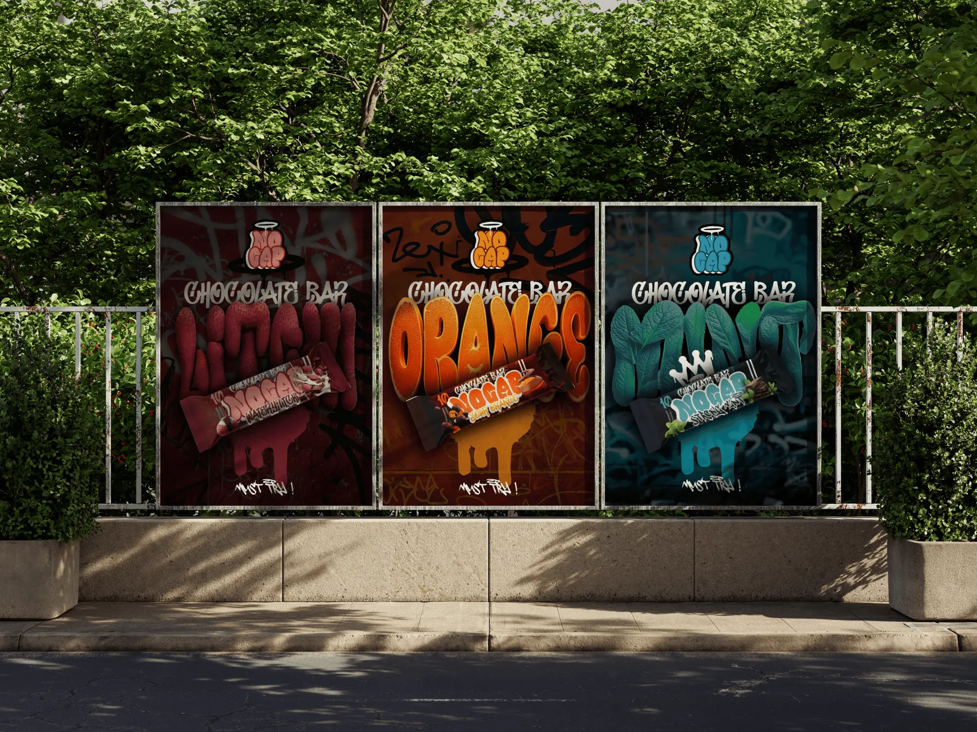
Chocolate shelves play it safe. The opportunity was a playful, expressive identity that still sits on a strict pack structure, so each flavour feels different and the brand stays recognisable.
What we did
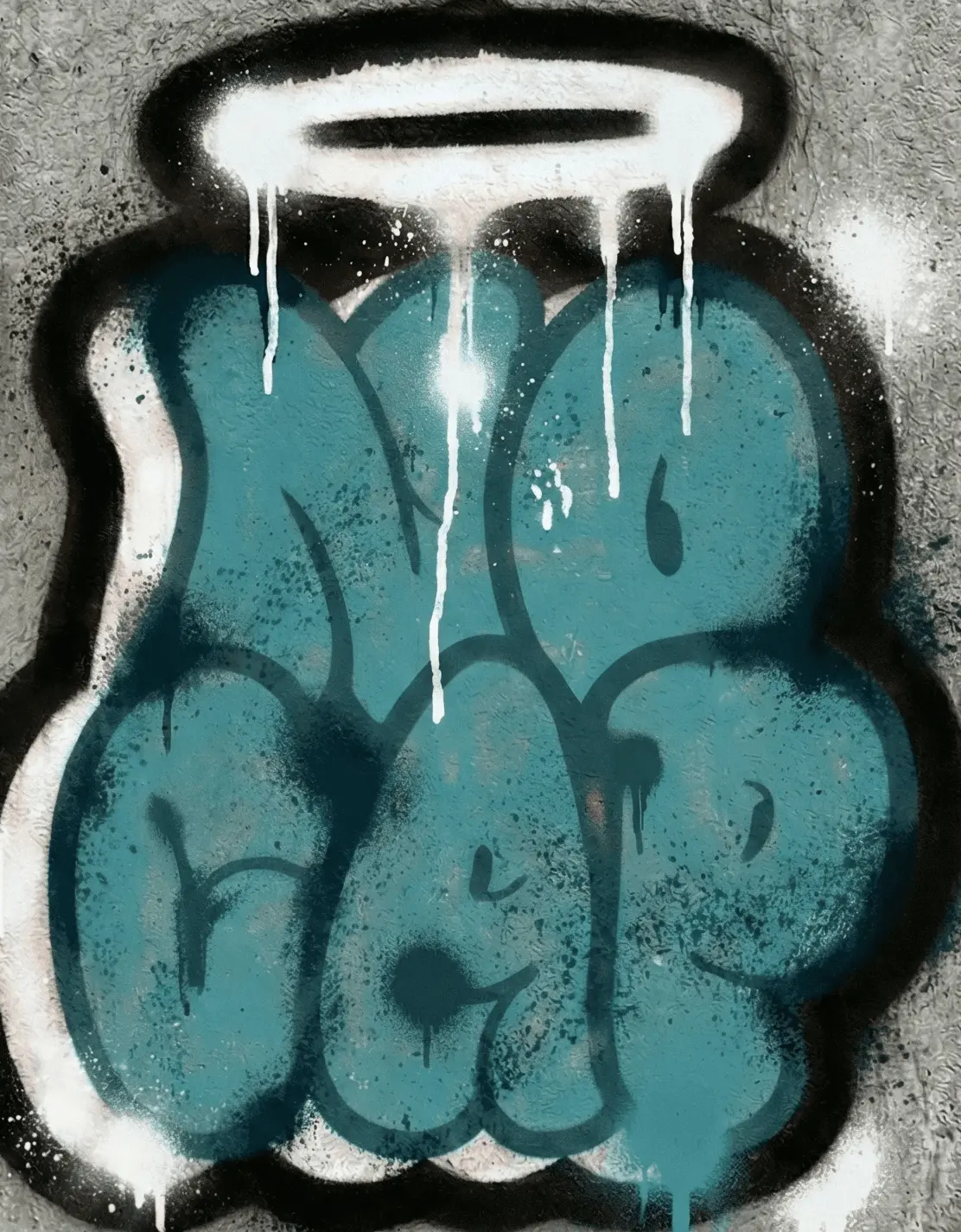
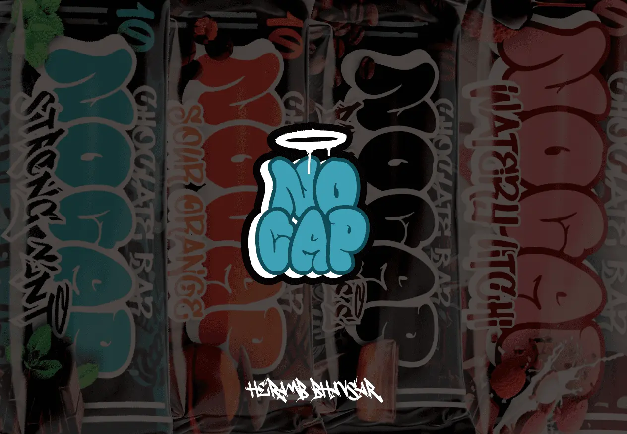
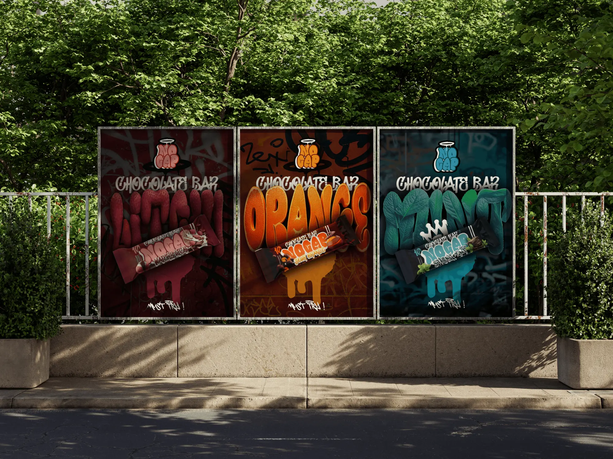
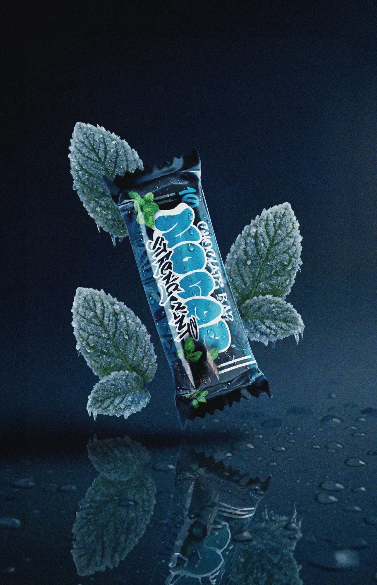
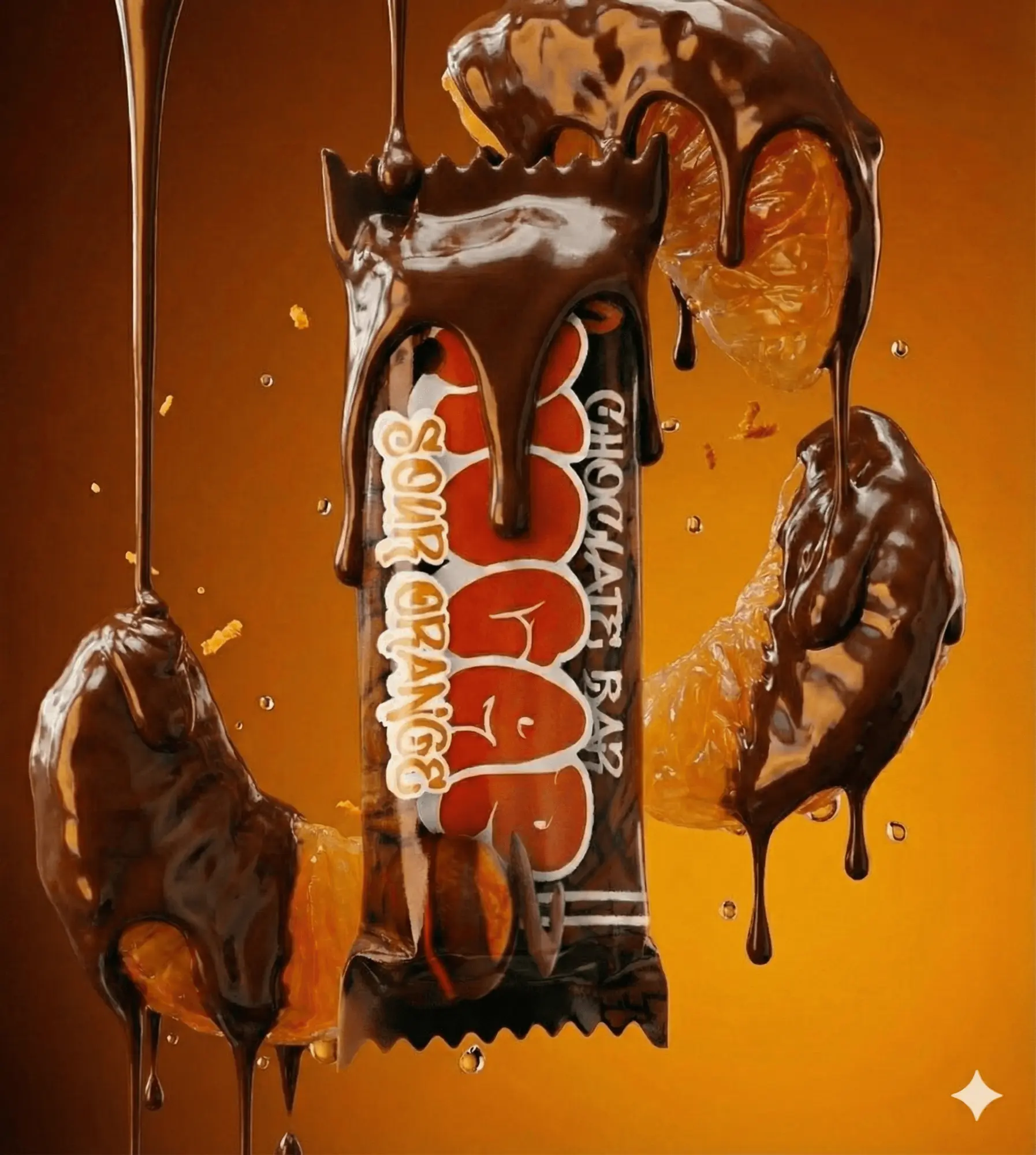
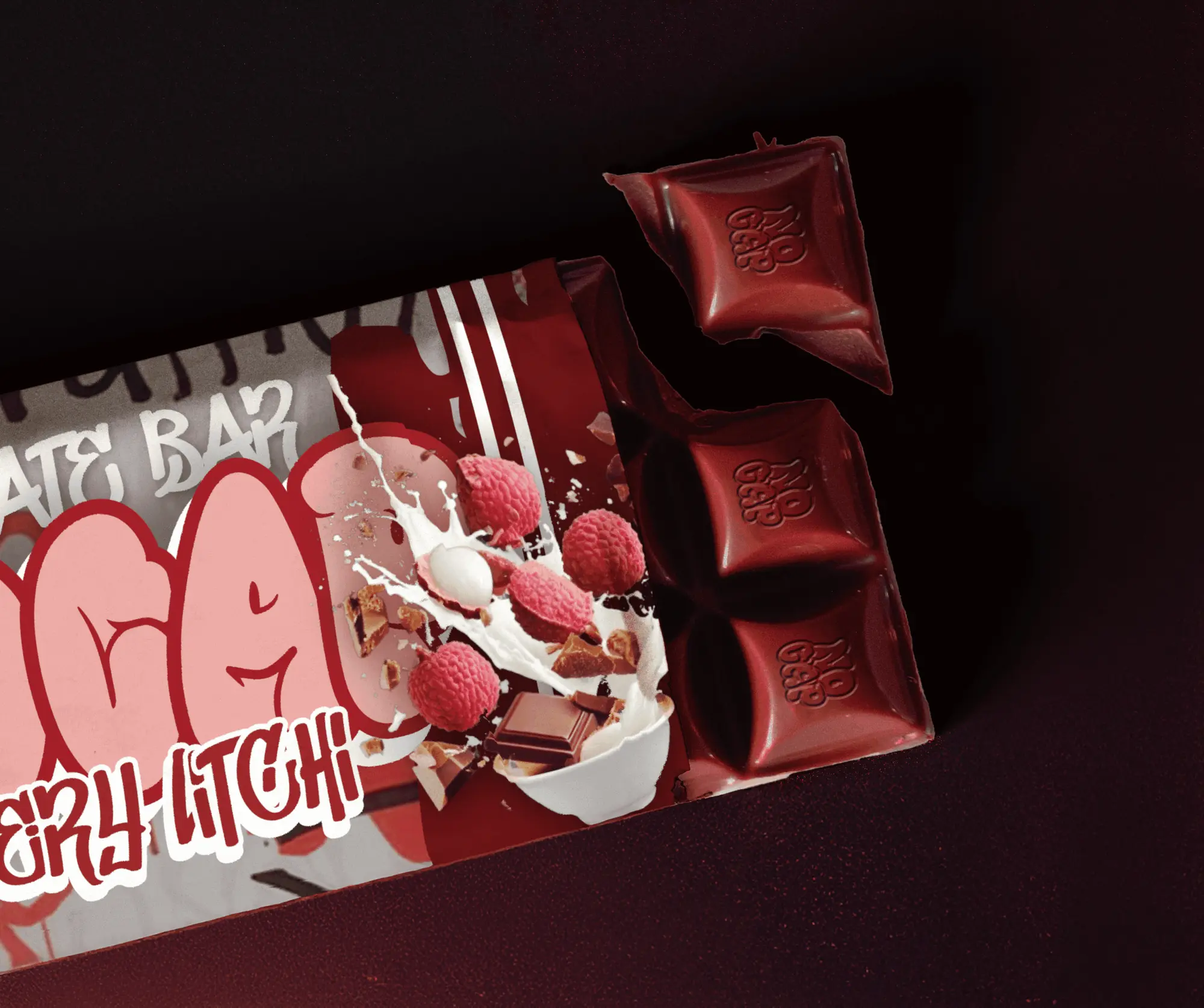
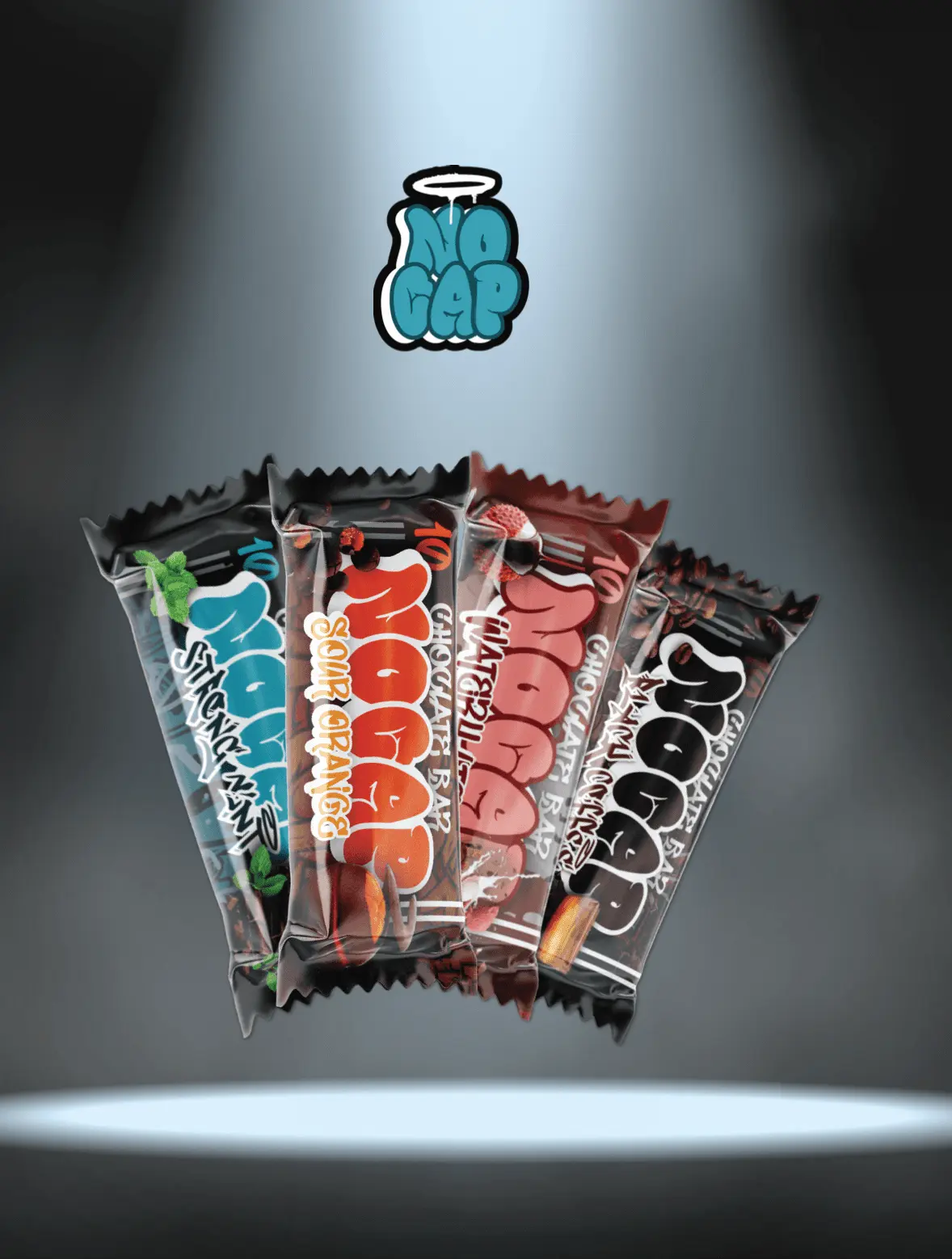
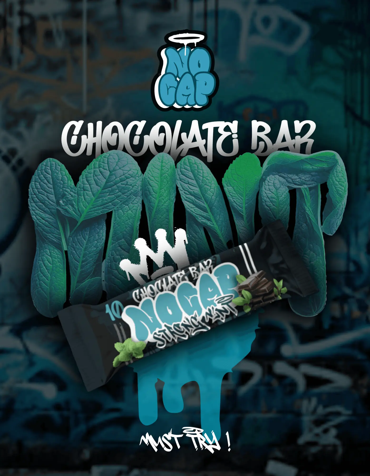
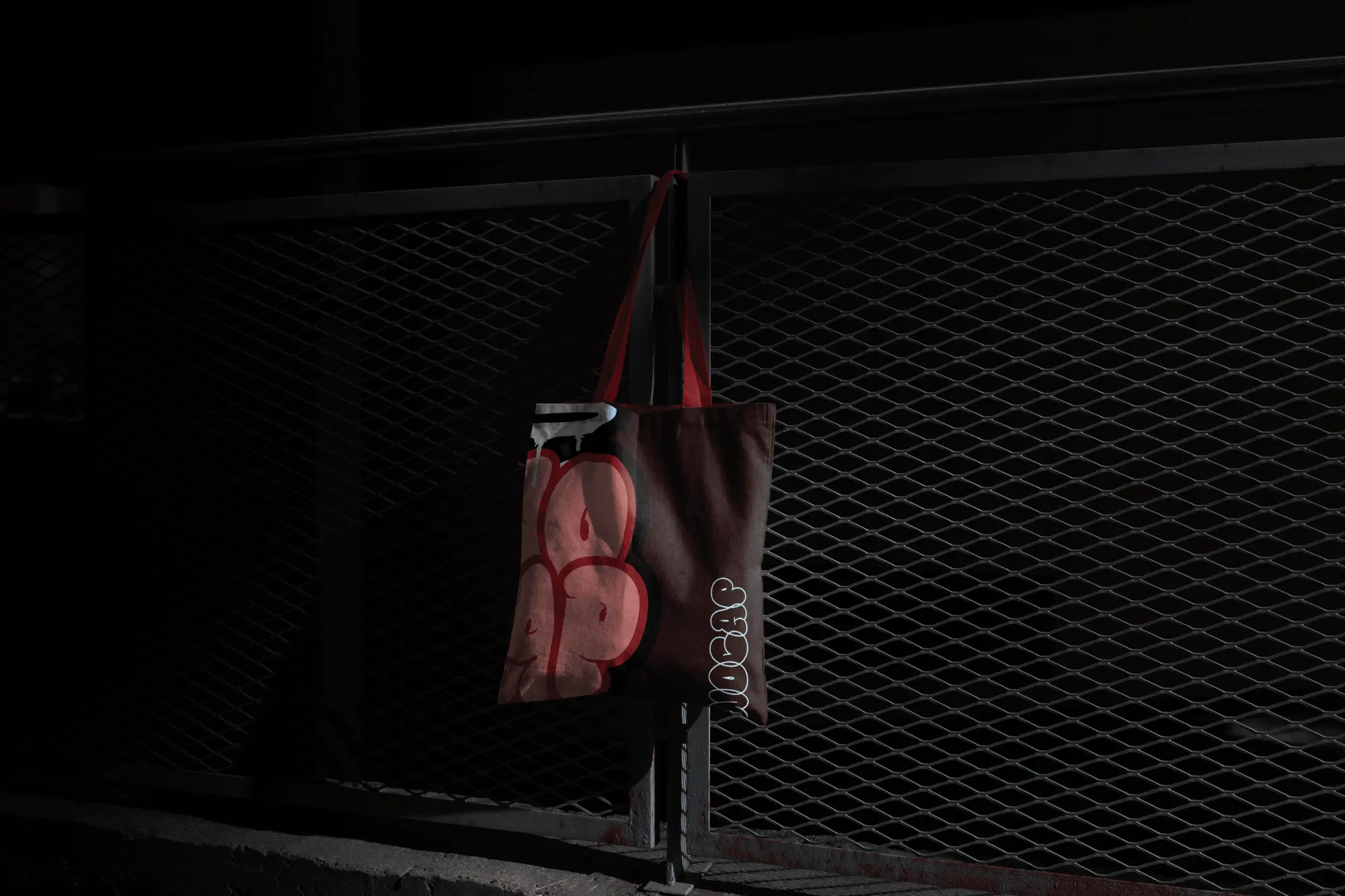
The identity borrows from street graffiti: a bubble-letter wordmark with a halo, drips and sprayed textures. Every bar uses the same layout — wordmark along the bar, flavour name beside it, the ingredient bursting through — and only the colour world changes. Posters were made to look sprayed on the street, and the wordmark holds up on its own on merch.